Top Menu
Main Menu
Main Menu toggle- Introduction
Introduction
- LRT Line
- Customer Service
Customer Service
- Safety Guide
- About Us
About Us

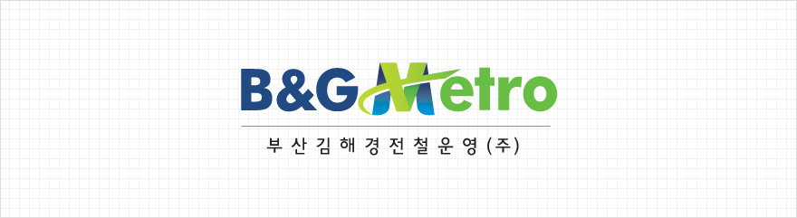
Meaning of the Design
The alphabet 'B' stands for 'Busan' but it also means 'Best' and ‘Best company in operating light rail transit.’ 'G' stands for 'Gimhae' and also ‘Green’, the color that represents environment-friendly, green transportation.
Color: Deep Blue
Blue is a color that symbolizes trust, stability, dreams and hope. The deep blue represents the deep, trusting relationship between the company and the customers as well as the company’s environment that gives the employees the opportunities to pursue their dreams and passion.
Meaning of the Design
Metro의  The alphabet ‘M’ in Metro symbolizes the beautiful city of Busan, Gimhae’s coastal line and environment-friendly, green transportation.
Color: Light Green
The color light green symbolizes the beautiful city of Busan, Gimhae’s coastal line and environment-friendly, green transportation.